
In 2016, my Art 8 class project took inspiration from the retro postcard campaign, 'Wish You Were Here'. Our postcards were created using torn magazine colours and collage techniques. We selected a place where we'd been that held a special memory. Sketched it out. The rest is history!

As we are in Week 8 of this pandemic, I've decided to reintroduce the project, but this time it would be entitled, 'Wish I Was There'. Students will need to sift through their memories or pictures of things they did or places they are missing, but can't do with our new Stay At Home responsibility.
SUPPLIES
*magazines
*glue stick or Mod Podge
*4x6" cardstock, sketchbook page, or cracker box to glue pieces on
*varied magazine fonts to spell your DESTINATION
STEP 1
find a photo or sketch a place you have been missing. Add colour to your sketch.

STEP 2
grab your magazines and tear out pages of colours needed.

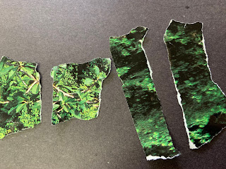
STEP 3
now tear into loonie or toonie sized pieces or tear long skinny strips (for the sky). HINT: if you tear or pull up you will get a white edge of fibres. If you tear downwards, you'll get a coloured edge. This will add interest to your finished piece. Also the fibres help to create a smoother surface when gluing down vs a cut edge (you can feel a lip when moving your fingers across pieces).
STEP 4
start gluing down your pieces from the top edge of your 4x6" postcard background. Working L to R. Working top to bottom. OVERLAP each piece slightly. No background should show through. Leave an overhang so you can seal edges by folding over and gluing onto the back.


STEP 5
continue from BACKGROUND down to MIDGROUND and then FOREGROUND.
STEP 6
Using FOUND fonts from magazine add your DESTINATION at the top (L or R side) . Include your initials on the bottom R corner in found fonts.
AM I FINISHED?? run your hand over your collage? Does it feel smooth? Is it rough? Are there edges that need to be glued down? It should feel nice and smooth and no 'catches' as you run your hand over it.

Remember to overlap pieces, and build your picture from farthest away to closest to. In my Kelowna sample above, I started with blue sky, then added yellow sun, then the cliffs behind the golf course. Then I added the landscaping along fairway, then flowers behind the green, the green itself, the flowers in front and lastly I added the flagstick and ball in hole (I cut those out to create contrast and crispness to the man-made objects.

Watch the video below to see samples of the 2016 SMS Art students' project and how they handled the progression from Background to Foreground.

SUPPLIES
*magazines
*glue stick or Mod Podge
*4x6" cardstock, sketchbook page, or cracker box to glue pieces on
*varied magazine fonts to spell your DESTINATION
LET'S GET STARTED!
STEP 1
find a photo or sketch a place you have been missing. Add colour to your sketch.

STEP 2
grab your magazines and tear out pages of colours needed.

STEP 3
now tear into loonie or toonie sized pieces or tear long skinny strips (for the sky). HINT: if you tear or pull up you will get a white edge of fibres. If you tear downwards, you'll get a coloured edge. This will add interest to your finished piece. Also the fibres help to create a smoother surface when gluing down vs a cut edge (you can feel a lip when moving your fingers across pieces).

STEP 4
start gluing down your pieces from the top edge of your 4x6" postcard background. Working L to R. Working top to bottom. OVERLAP each piece slightly. No background should show through. Leave an overhang so you can seal edges by folding over and gluing onto the back.


STEP 5
continue from BACKGROUND down to MIDGROUND and then FOREGROUND.
STEP 6
Using FOUND fonts from magazine add your DESTINATION at the top (L or R side) . Include your initials on the bottom R corner in found fonts.
AM I FINISHED?? run your hand over your collage? Does it feel smooth? Is it rough? Are there edges that need to be glued down? It should feel nice and smooth and no 'catches' as you run your hand over it.

Remember to overlap pieces, and build your picture from farthest away to closest to. In my Kelowna sample above, I started with blue sky, then added yellow sun, then the cliffs behind the golf course. Then I added the landscaping along fairway, then flowers behind the green, the green itself, the flowers in front and lastly I added the flagstick and ball in hole (I cut those out to create contrast and crispness to the man-made objects.

Watch the video below to see samples of the 2016 SMS Art students' project and how they handled the progression from Background to Foreground.
Once you finish, send photos of your project (progression) to: mspsartroomatsms@gmail.com


No comments:
Post a Comment